Decorate Your Toronto Home With New Pastels
Colour, Decor, HopeDesigns.ca, Interior Decorating Tips
February 29, 2016It’s been a few months now since Pantone announced its new “it” colours: Rose Quartz and Serenity. By now you’ve had some time to figure out exactly how to infuse these pastel colours into your home decor. But perhaps it’s a little trickier than you first thought! No worries – we’ve conjured up a few smart and savvy ways to bring new pastel colours to help you stylishly Decorate Your Toronto Home for the spring season!
Decorate Your Toronto Home : Use One Solitary-Yet-Emphasized Pastel Accent
Pastels aren’t exactly known for being bold and vibrant, but they can actually achieve that status when they stand out on their own in the form of one single pastel-coloured accent.
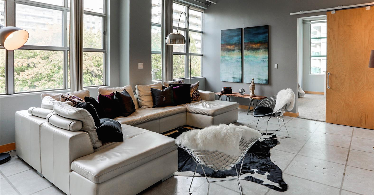
For instance, an all-white kitchen is an unexpected place to find a pastel-coloured countertop or corner cabinet. It would also make a splash in a living space in the form of a pastel loveseat amidst other neutral-toned furnishings and wall paint.
Swap Neutrals For Chalky Colours
Neutral colours don’t have to be narrowed down to just whites and beiges. Instead, you can swap those typical neutrals when you Decorate Your Toronto Home with chalky colours to be paired with your neutral hue of choice. This will help to add a little more esthetic appeal and interest to a space that would otherwise be a tad on the boring side.
For instance, consider pairing your pastel colour with a warm peach or soft yellow in place of cream or beige. These pale hues work well to create character while not overwhelming the senses, especially in smaller spaces.
Partner Pastels With Vibrant Hues
If you want to go the more bold route when you Decorate Your Toronto Home, consider pairing your pastels with more vibrant colours, like cherry red or emerald green. These can work especially well when you’ve got a lot of square footage to work with – that way you’re not bombarding the space with too much vibrancy crammed into a tight spot.
Adding a contrasting colour to your pastel allows the space to break free from a monotone look, and add an energy-filled aura to the overall colour palette of the room.
Avoid the Temptation to Add Too Many Pastels in One Space
Just because spring and Easter are around the corner doesn’t mean that gives you a pass to turn your home into an Easter egg. Too many pastel colours mashed in one space risks this effect, so be sure to resist the urge to throw in powder pink, soft blue and pale lavender altogether.
If you’re having trouble deciding on just one, consider sticking to Pantone’s recommendations of Rose Quartz and Serenity, then slowly bring it into the space in the form of an accent piece.
Need more ideas on how to effectively bring pastels into you home’s interior decor? Hope Designs has the answers. We’re constantly revamping our clients’ homes with all sorts of different looks, including blending pastels into the decor. Let us help you pick the right shade to infuse into your home for a stylish, sophisticated look! Visit HopeDesigns.ca today!